
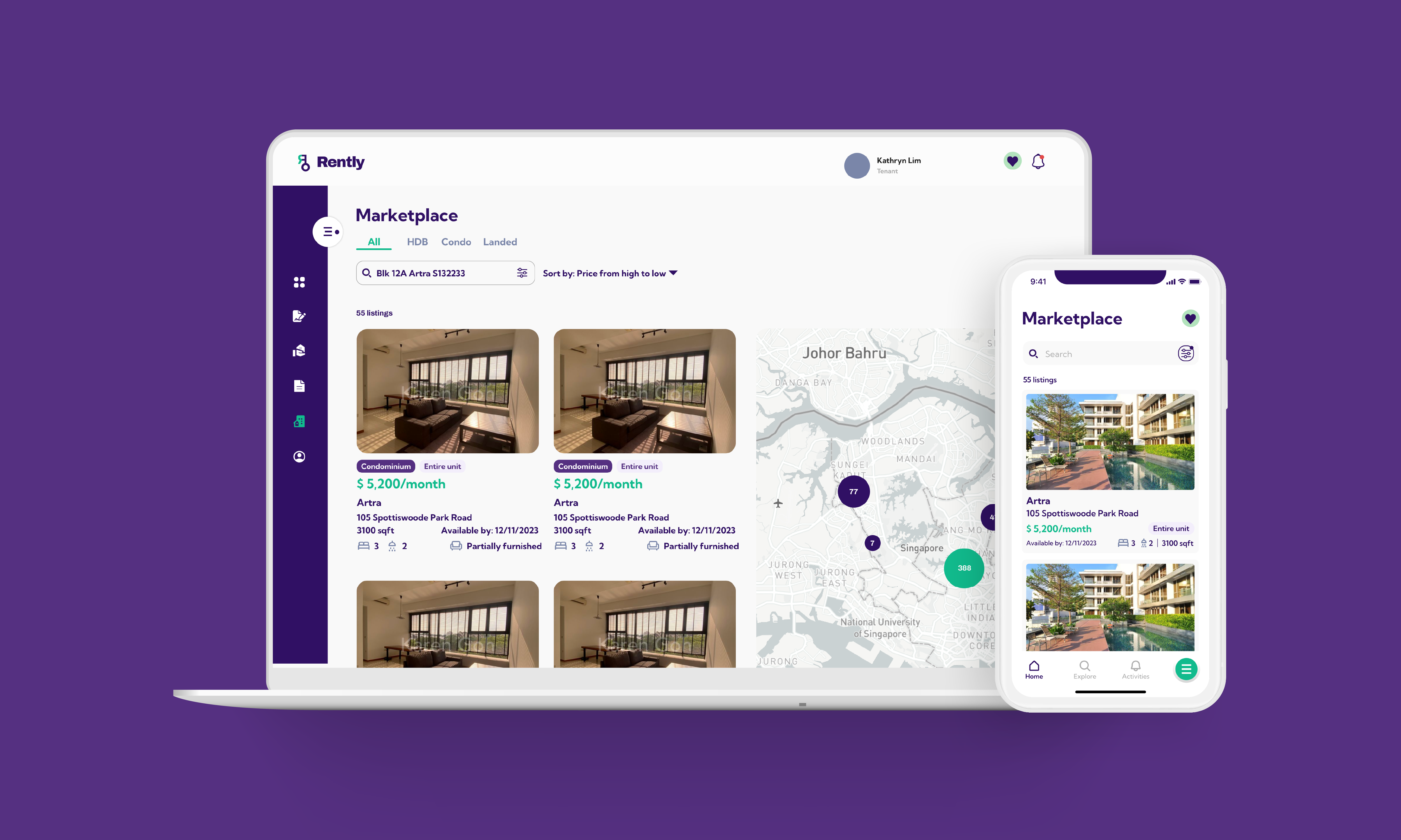
Marketplace UI Revamp:
Establishing clarity and consistency across Rently’s core experience
OVERVIEW
The first project that I took on was revamping the Marketplace for both app and website with the goal of improving the tenants' and landlords' user experience. Rently’s initial marketplace was built before the design system was in place and several of the design choices were made by developers instead of a designer.

OUTCOME
Significantly revamped the product with numerous features, resulting in an updated, modern, and responsive digital experience.
The released platform was later reported (EdgeProp, 2024) to achieve a 20–30% higher tenancy conversion rate compared to traditional listing platforms.
TIMELINE
Sept - Nov 2023
ROLE
Product Designer
ROLE
Product Designer
USER RESEARCH
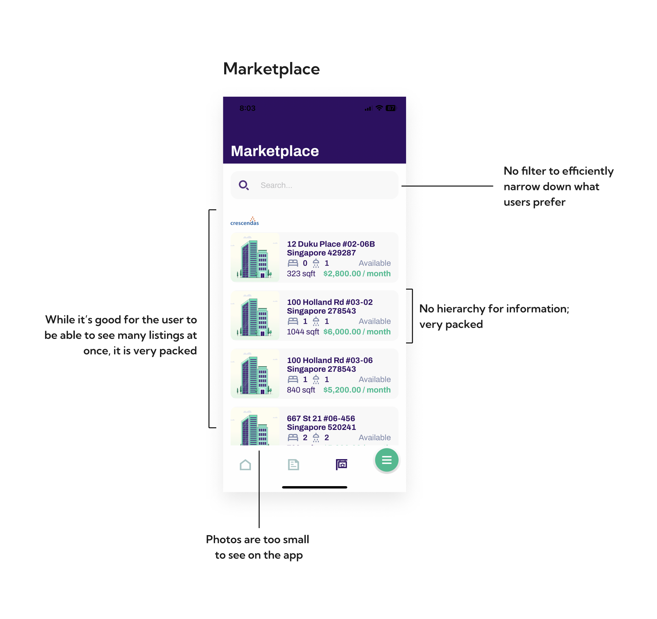
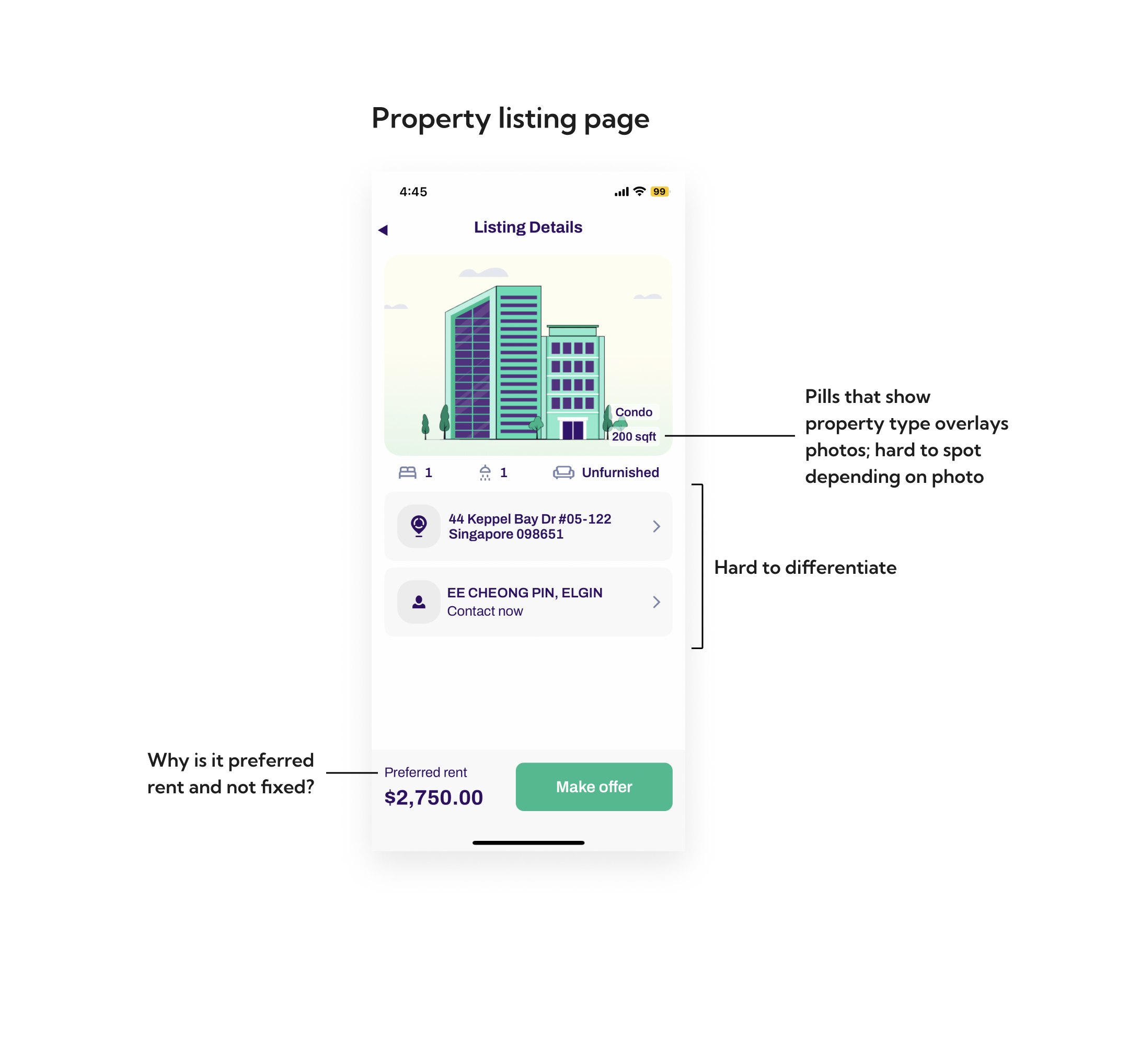
Heuristic evaluation: My first step when tackling this project was to conduct a heuristic evaluation for both the app and website and identify the flaws and points for potential improvement. Below are a few problems that I’ve identified with the app at the start.
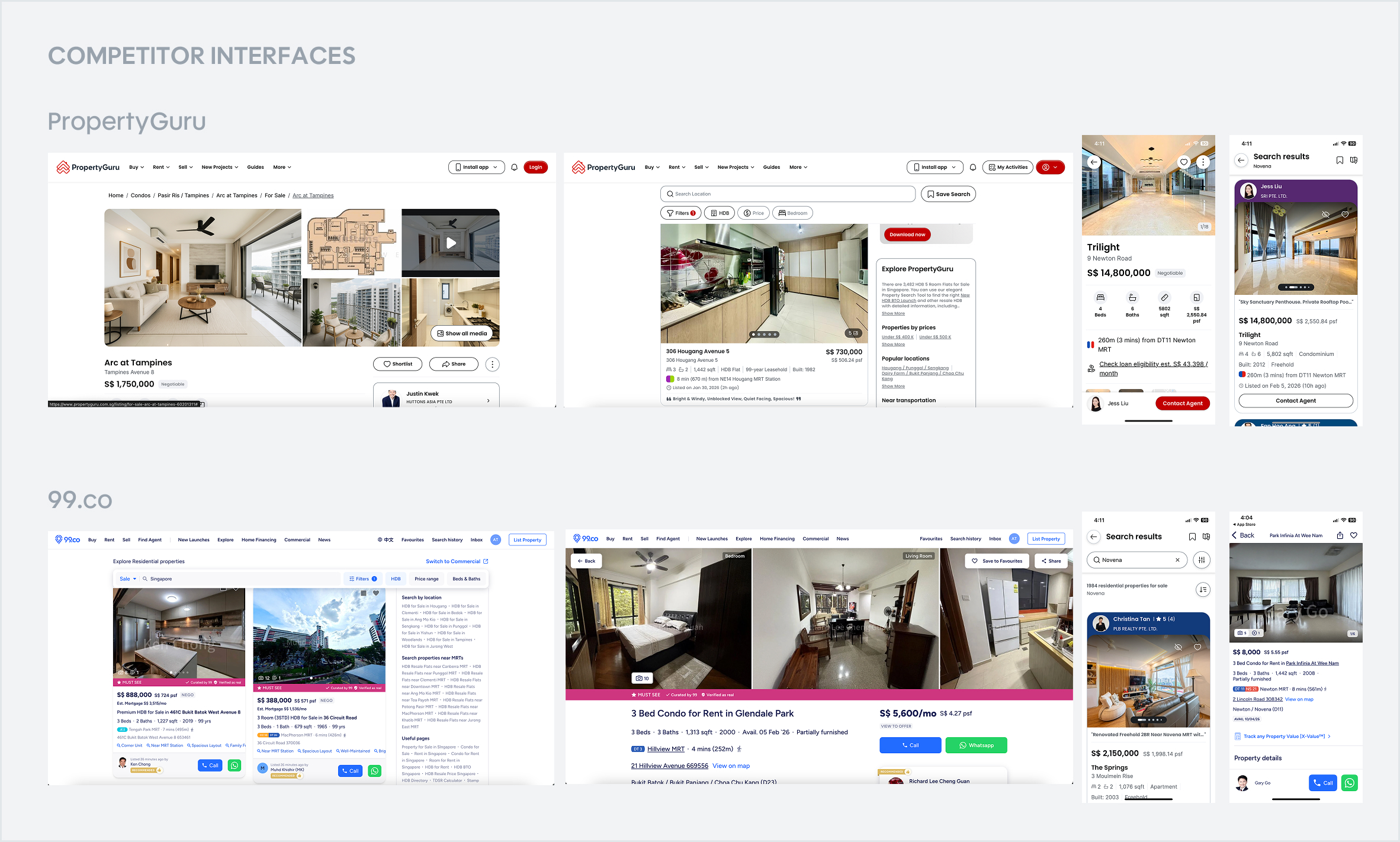
Competitor Analysis: I analyzed 2 competitors - Propertyguru and 99.co, to see how they curated property listings for rent.
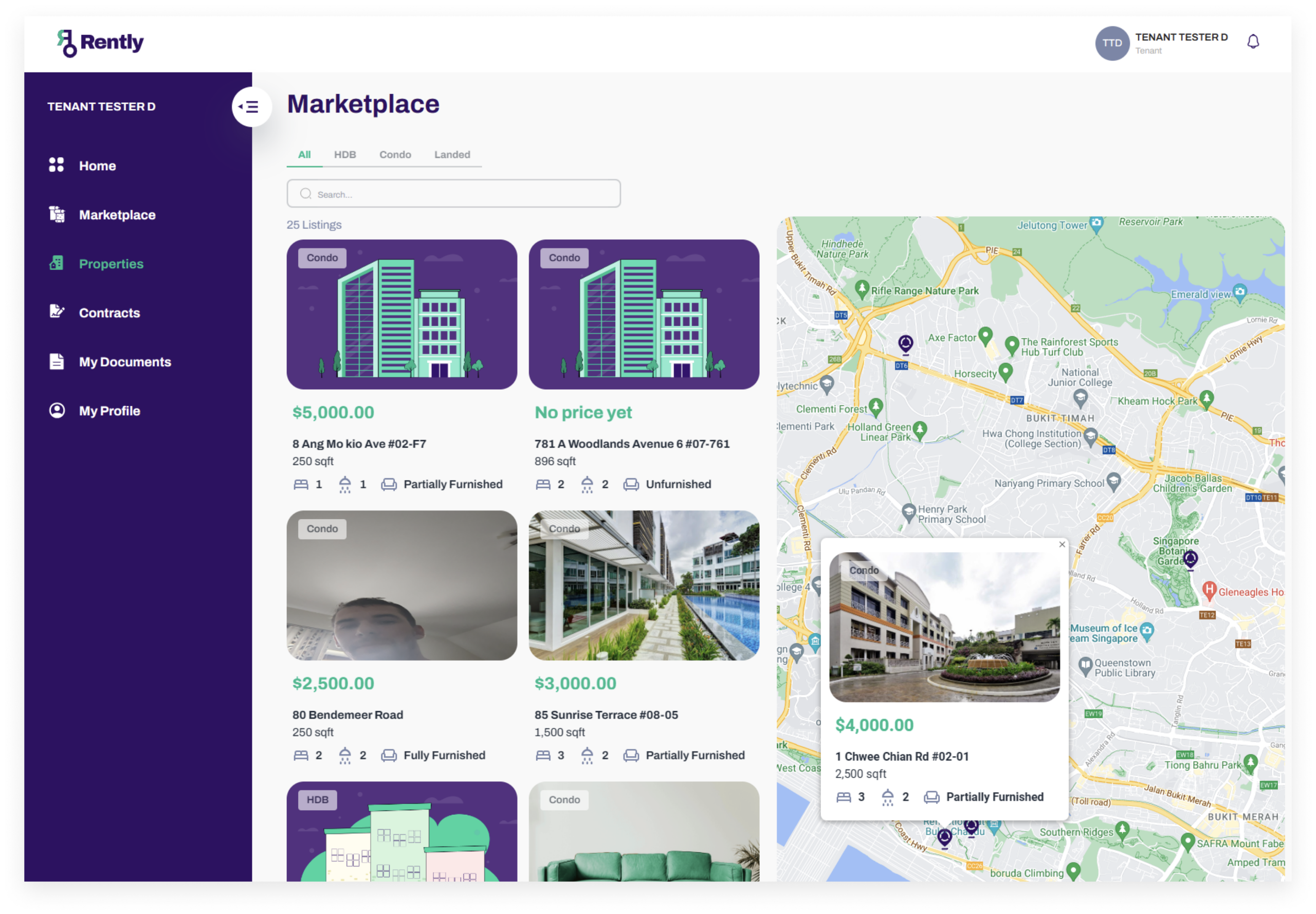
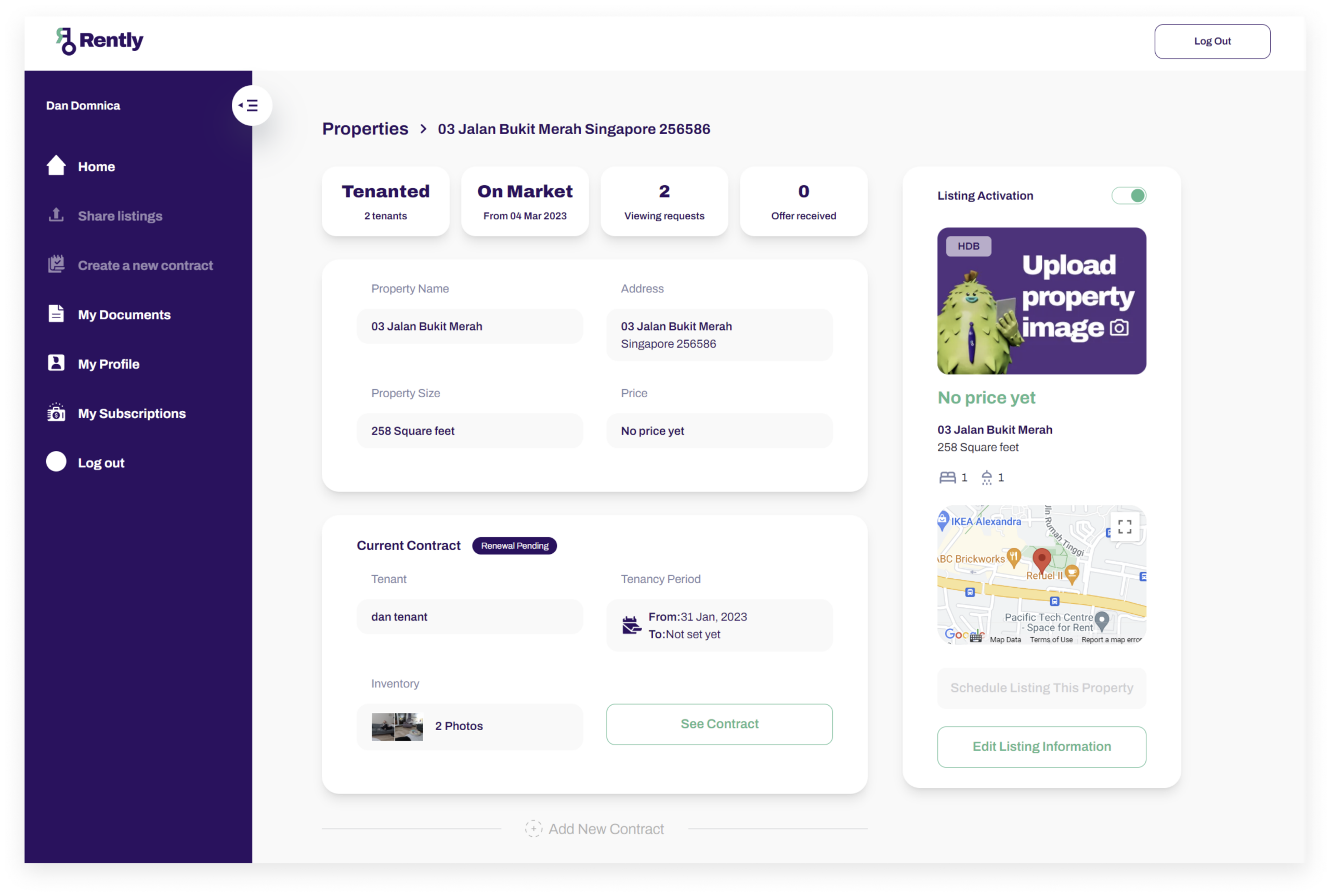
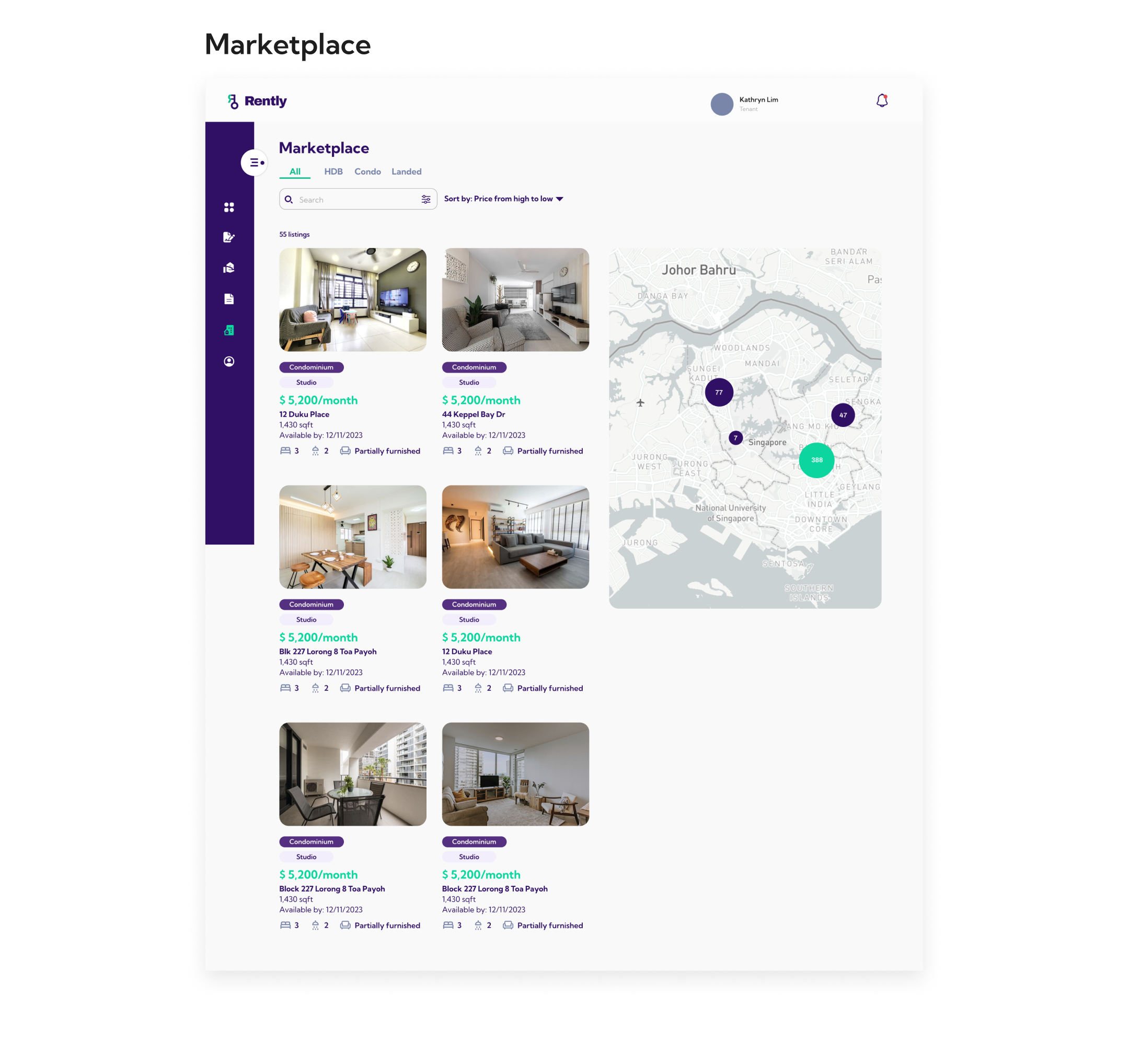
The marketplace web follows a similar structure to the app's.
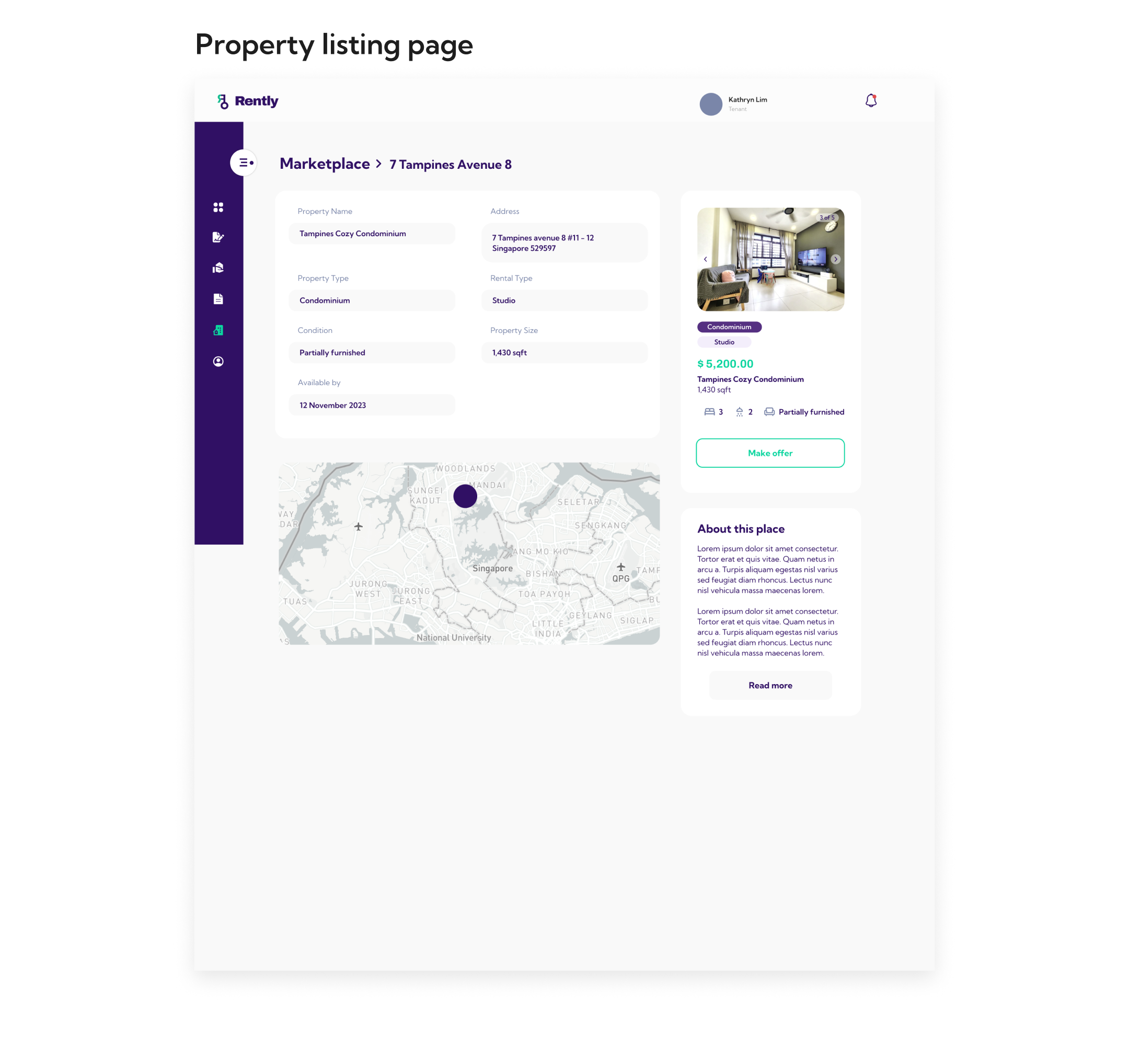
Another observation is that the elements in the property listing detail page has a shadow but the property listing card in the marketplace doesn't; hence making it look inconsistent.
PROJECT SCOPE & CONSTRAINTS
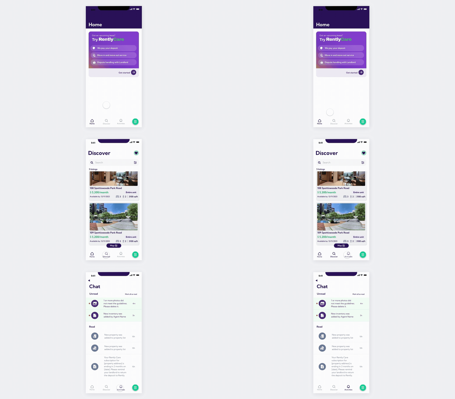
After discussing with the developers and stakeholders, it was decided that the marketplace needed a quick redesign to increase usability for the time being, rather than a complete overhaul. Thus, I avoided making too drastic of a change to these screens as it would have been too time consuming to implement at the time. It was also decided that the marketplace was also lacking a filter and map feature - which is something that is deemed essential for a rental property product as users would often search for properties based on their desired residential area.
The biggest issue was the property listing card on the app. While it was designed initially to show the users as many properties as possible without the need to scroll excessively, users had difficulty in seeing what the property looked like as the photo was very small. Information (Address, amenities, sqft, rental cost, type of property) was also very cluttered due to the size of the listing card.
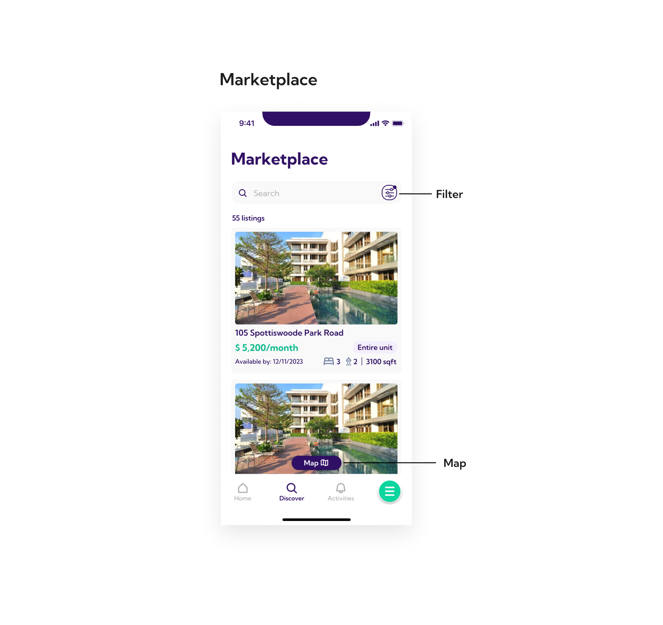
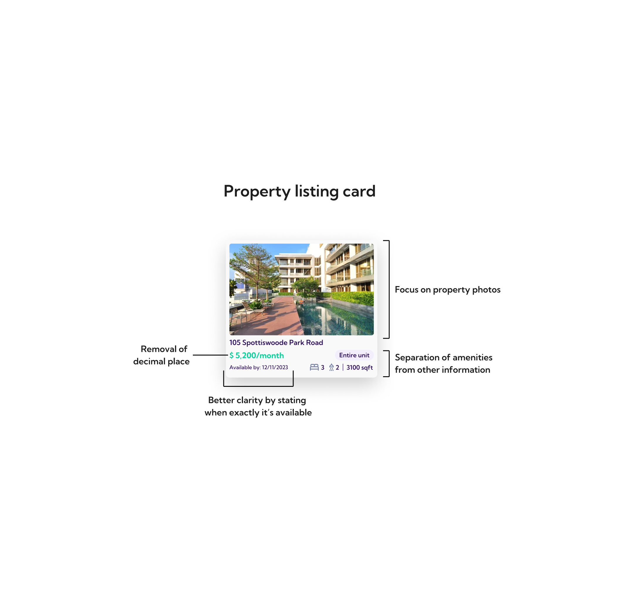

SOLUTION
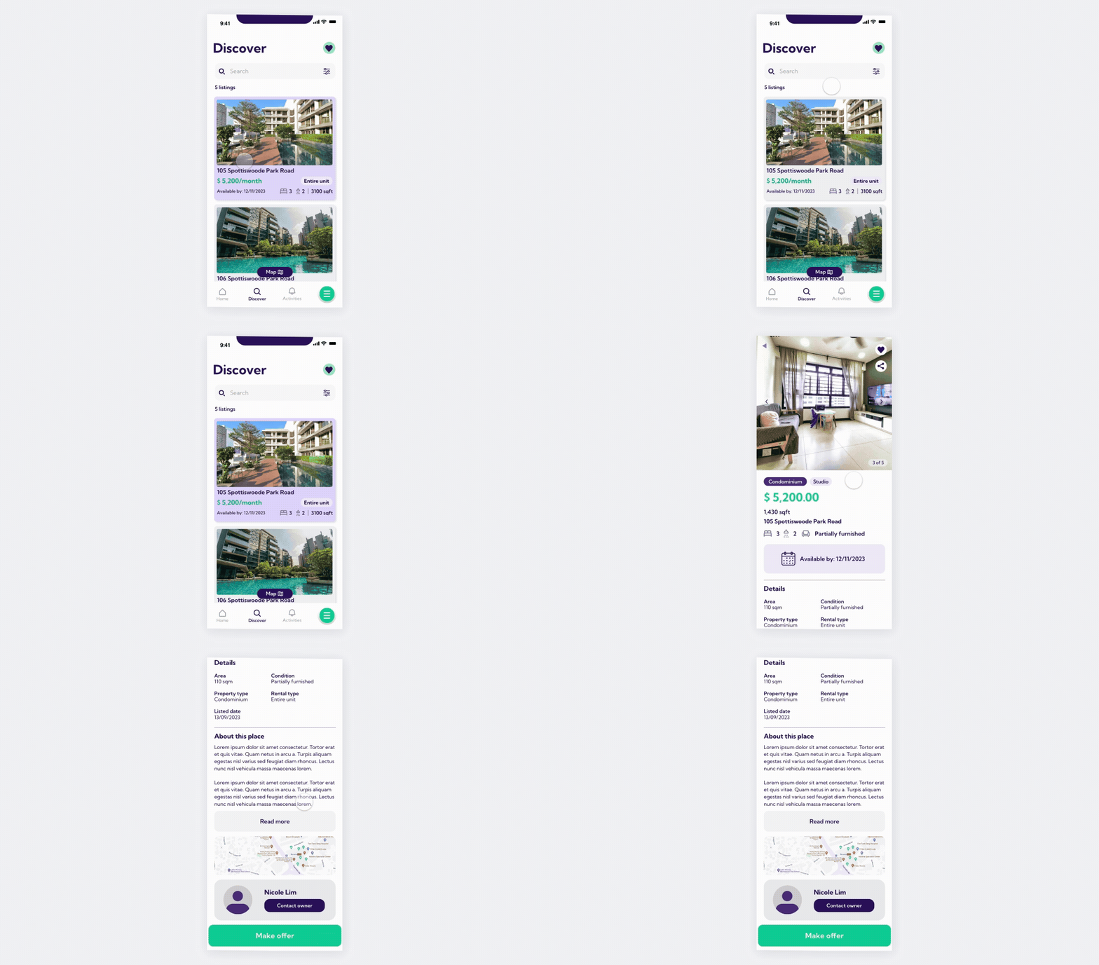
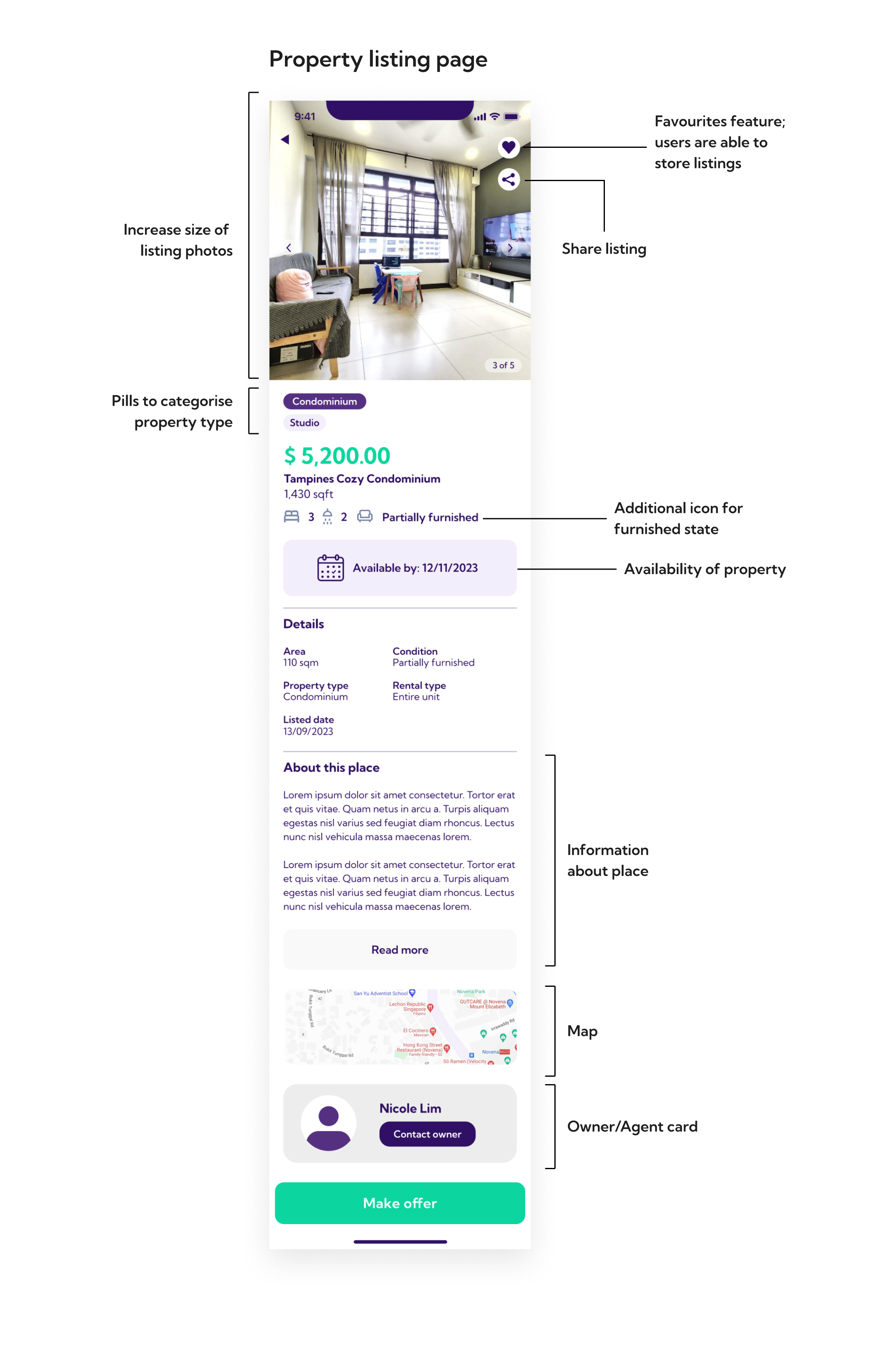
Property listing page: The property type pills were taken out and placed below the photos for better visibility. Photo area was expanded to take up the whole width to make it look more dynamic. A landlord/agent contact card was designed with a profile pic option so that it adds genuinity to the listing.
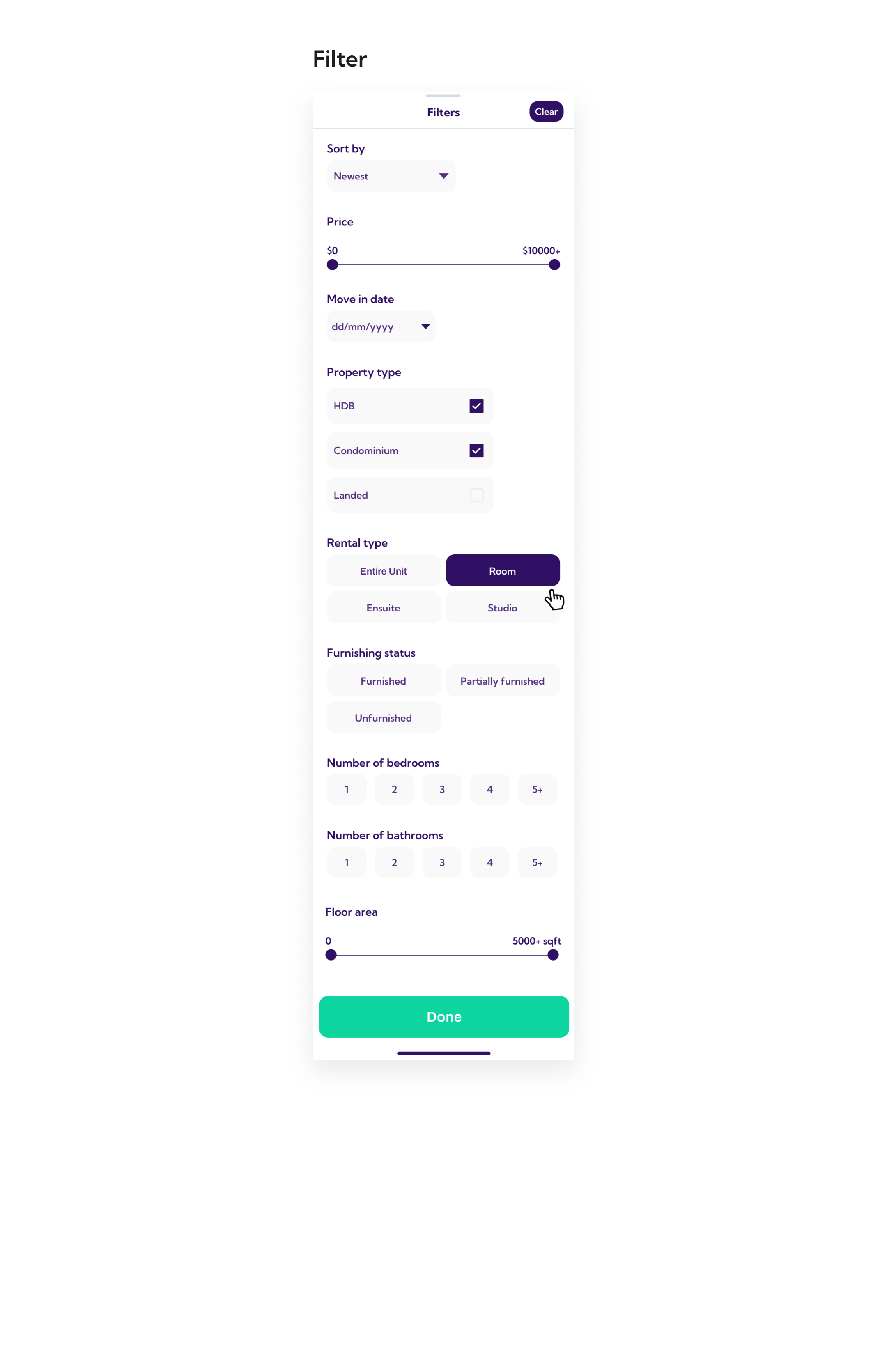
Filter: The filter was based off the conditions that users will look out for in a rental property (Information provided by Sales team). A 'Sort by' and 'Clear' button was also added so that users can further categorise their search results (Some may not care where the property is it has the best price)