Year: February 2024
Role: Product Designer
Background: Rently is a fintech startup that enables end-to-end support for the property rental process, from property listing and tenant acquisition, to contract negotiation, signing and managing tenancy support requests.
It offers Asia Pacific's first deposit-free service that grants tenants the convenience of skipping the downsides of hefty deposits while safeguarding them from potential rental scams or landlord/tenant disputes. Through the integration of national digital IDs like SingPass, Rently is able to ensure convenient and secure rental transactions for both tenants and landlords.
With the effort of the Marketing team in getting Rently’s name out in the public, there has been several reports from media outlets.
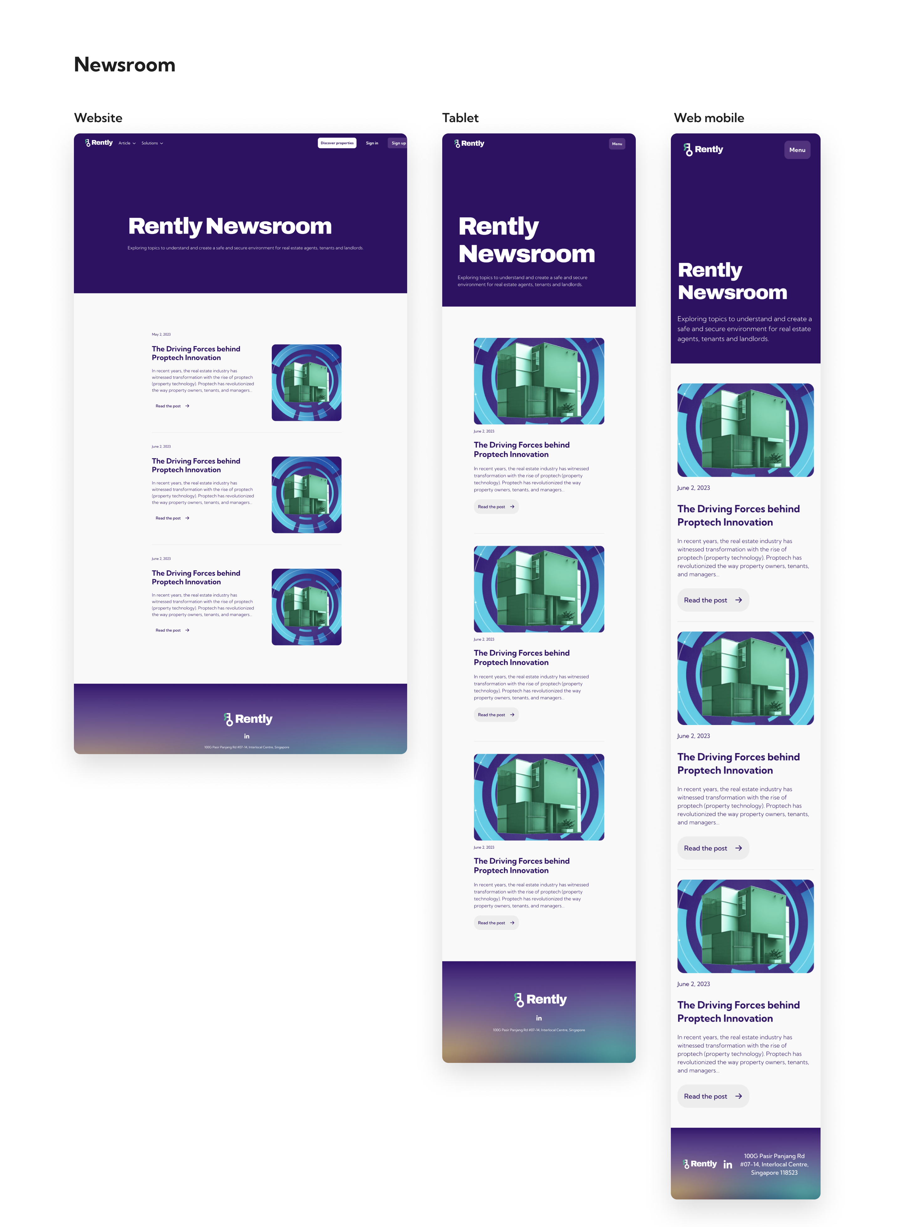
Rently.sg does not have a dedicated, centralised space to showcase press releases and media coverage. The absence of a platform specifically designed for news content limits SEO performance and social media back-linking strategies. As such, a dedicated newsroom was needed.
Objectives:
- Increase website traffic from search engines and social media.
- Higher engagement rates with Newsroom content.
- Enhanced credibility and trustworthiness of Rently.sg among users and stakeholders.
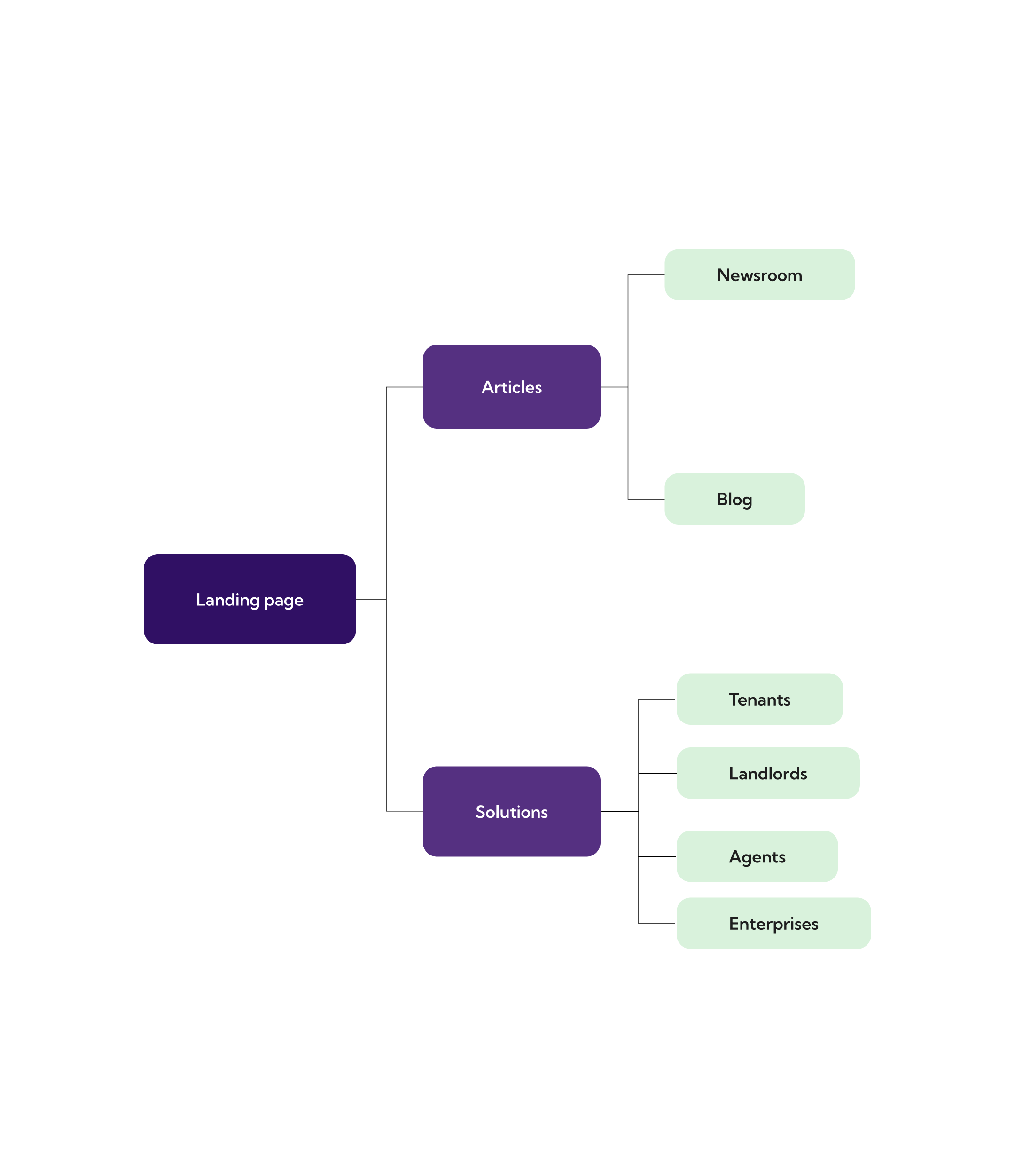
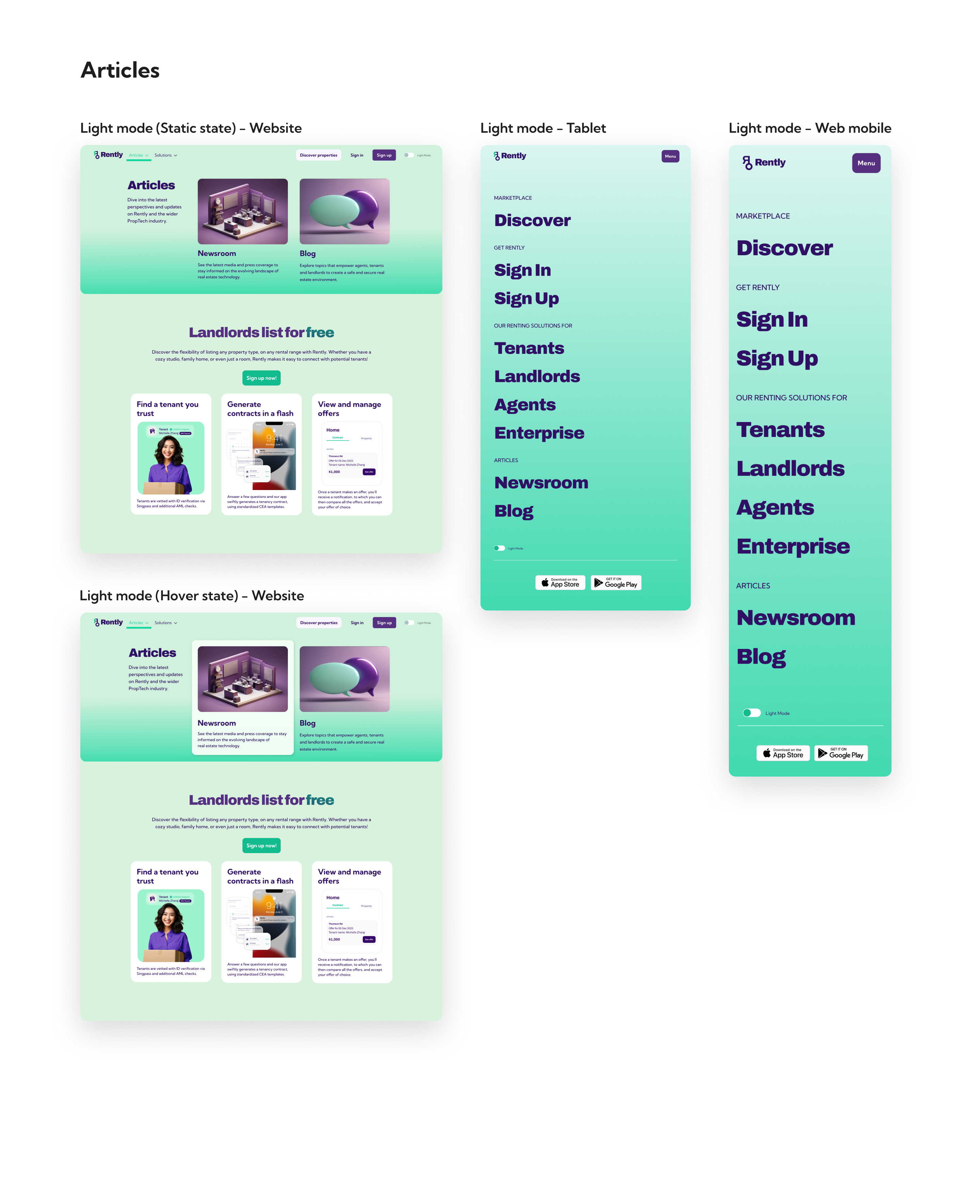
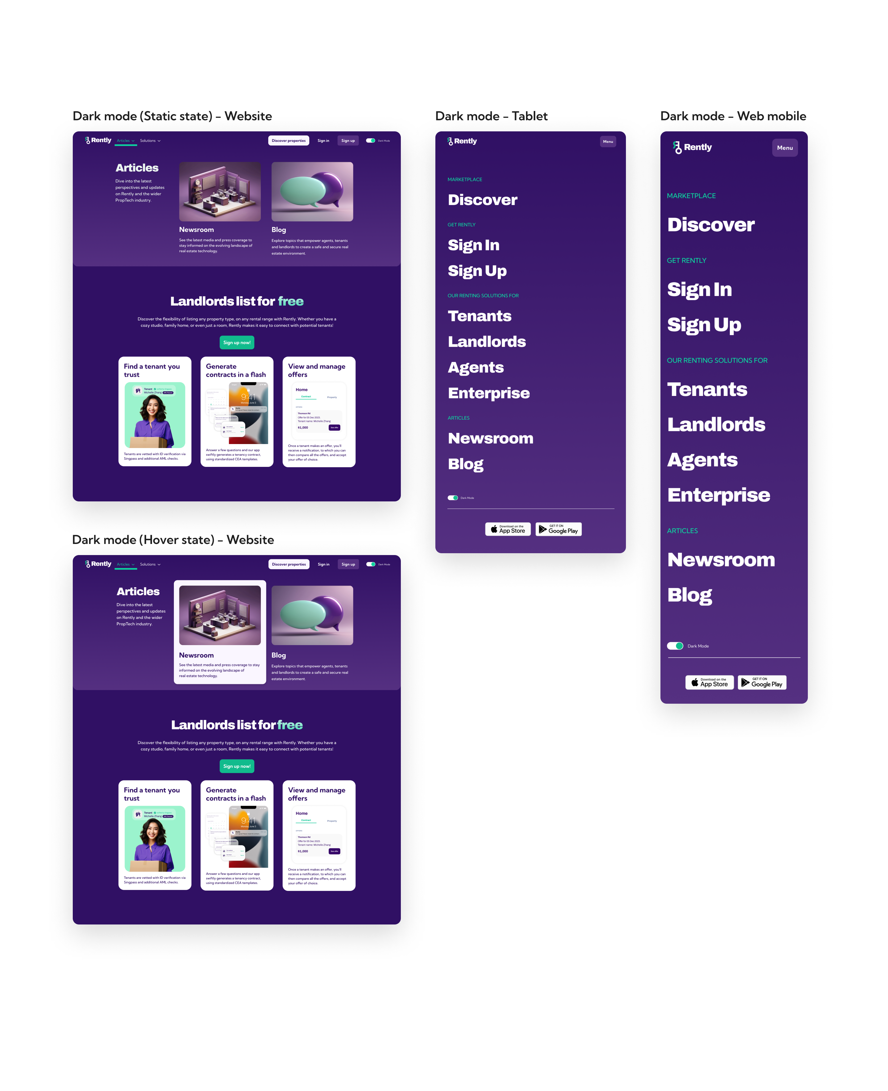
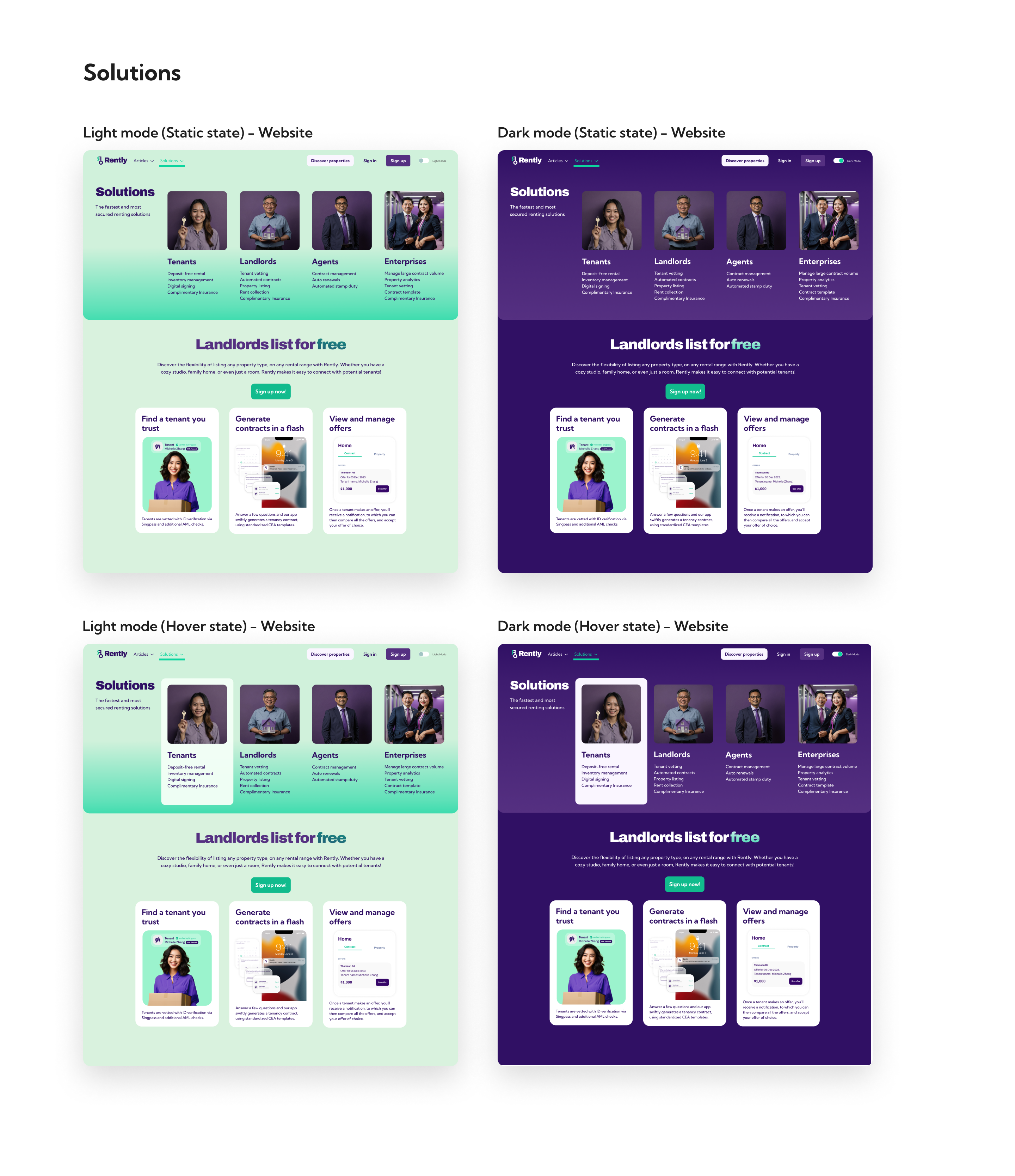
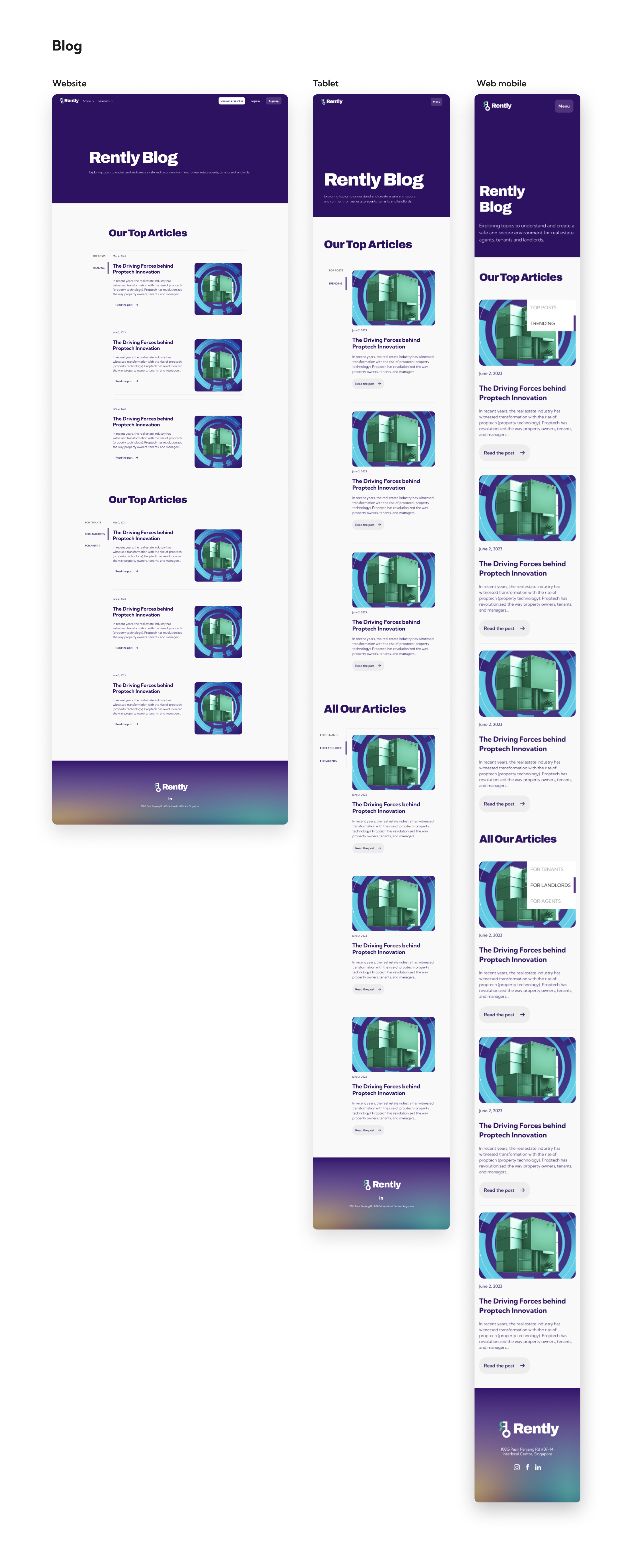
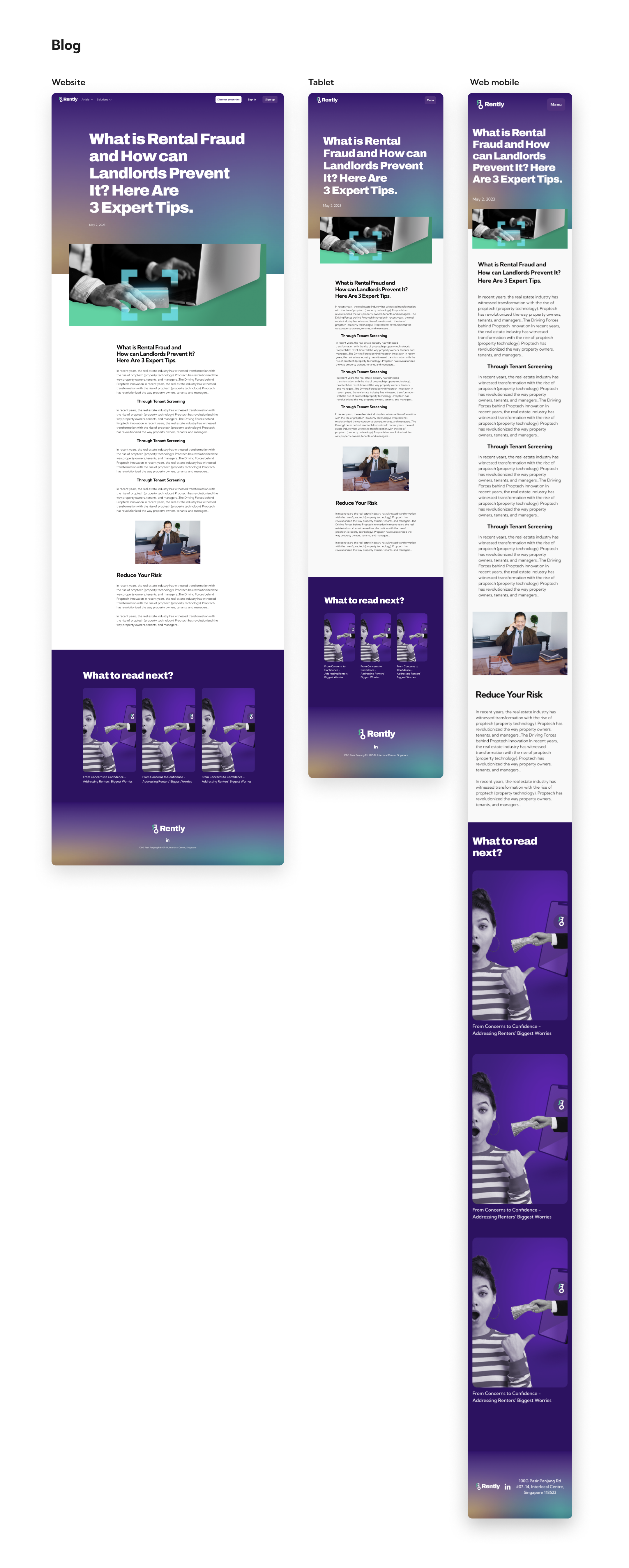
The initial navigation bar only had 2 sections - Newsroom & Solutions. Despite the name, it was made out of opinion pieces written by the co-founders on the rental property landscape. After working with the Marketing team, it was decided that any written pieces by the co-founders would be under the section 'Blog', while the media coverage of the company be under the section 'Newsroom'. Both 'Newsroom' and 'Blog' would be under the section 'Articles'.
After discussing with the developers and Marketing team, it was decided that the specs for Newsroom & Blog (Section & Individual articles) would be based on the same design as the blog section as it would be less work for the developers. The main focus of this feature would be the redesign of the navigation bar and the change of photos for the thumbnails. The thumbnail photos were made using Leonardo.ai
The design of the navigation bar dropdown needed to compliment when the website is both in light and dark mode.
